
The development of user interfaces in Java typically involves dealing with layout managers. This means that components cannot easily be positioned using absolute coordinates and sizes, but the layout manager is responsible for placing the components on the screen based on constraints the developer has defined. While this approach is very flexible and enables a Java application to cope with different platforms, it certainly does not simplify the creation of a good-looking and ergonomic GUI.
From the beginning, the Java development kit offered a number of layout managers. Most of them are pretty simple and do not support the creation of a sophisticated user interface out of the box. The idea was to nest multiple panels with different layout managers to achieve more complex layouts. This works to a certain degree, but if the UI becomes more complex, the required code for building the panels and nesting them properly also grows more and more complex; and if you want to rearrange something later, you are in a maintenance nightmare! In addition to these simple layout managers, the java.awt package provides the GridBagLayout class, which in principle allows arbitrary complex UIs. However, this layout manager is very hard to understand - this is probably the reason why it never becomes pretty popular.
With the PercentLayout layout manager the JGUIraffe library tries to find a compromise: a layout that should not be too difficult to grasp, but that is powerful enough for complex user interfaces. PercentLayout is similar to the popular FormLayout of jGoodies. It provides the basic layout functionality implemented within JGUIraffe. On top of this class there are a couple of other layout managers for special purposes or frequent use cases. In the following sections the basics of PercentLayout are covered. Then we discuss the other layout managers shipped with JGUIraffe and present a usage example.
Similar to jGoodies' FormLayout PercentLayout organizes the UI in a tabular structure. The available space is grouped in columns and rows. Each cell in this table has certain properties that determine its size in both the X- and the Y-direction. Each cell can also host a component (e.g. a label, a checkbox, or a text field). Then its properties also define the component's size and alignment. For a better understanding take a look at the following figure:
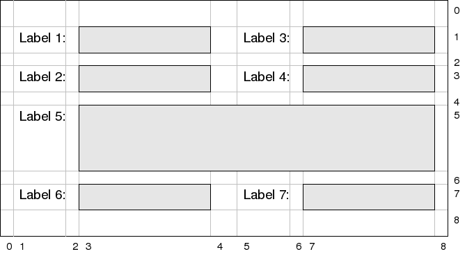
This picture shows a layout consisting of 9 columns and 9 rows. The structure of the layout is pretty regular: It contains labels and text input fields. In most cases the labels are contained in the columns with the indices 1 and 5, the input fields are located in the columns 3 and 7. So, from the user's point of view, a UI results consisting of two columns with input elements. PercentLayout is well suited for such regular layouts as it allows defining the properties for the columns and rows globally. Line 5 is somewhat special: it contains a larger text area spanning multiple columns, and it is also higher than the other rows. This demonstrates that single components can be treated in a specific way. Now, which properties are available for defining a cell in the layout?
When defining a column or a row the following properties can be set (note that these properties are independent for the cell's width and height; so, for instance, a different alignment can be set for the width than for the height):
In addition to the properties described so far, there is another aspect that influences the size of a cell: the so-called cell groups. A cell group combines multiple columns or rows with each other and ensures that they all have the same width or height. A use case for cell groups are columns with labels. In the example layout shown at the beginning of this section there are two columns with labels: column 1 and column 5. Per default the sizes of these columns would depend on the widths of the labels contained in them. So if column 1 contained only labels with short texts and column 5 contained labels with longer texts, the columns would have different widths. To avoid this a cell group can be defined that combines columns 1 and 5. This guarantees that these columns have the same width, i.e. the maximum width of both columns. The result certainly looks much better than a layout with different column sizes.
When defining a layout, often the preferred size of the components involved is used to determine the size of the layout. When the associated container is initially created the percent layout uses this information to calculate the container's size. This should result in an ideal appearance. We have already explained what happens if additional space becomes available: it is distributed over the layout's cells based on their weight factors. But what happens if the container becomes smaller?
The percent layout manager provides a boolean flag that determines its behavior in this case: canShrink. If this flag is set to false (the default value is true), the cells cannot become smaller than the size calculated based on the preferred sizes. If the user decreases the container's size more and more, parts of the UI are cut. This is shown in the following figure. As can be seen, parts of the lower right become invisible as the window becomes too small.
Note: There does not seem to be a reliable way in Swing to enforce a minimum size of a window. Even if all components involved have a minimum size set, the window can be dragged smaller - with the effect that parts of the UI become invisible as demonstrated by the figure. For dialog windows that do not benefit from additional size (e.g. because only small input fields for numbers or dates are contained) it may be a good solution to disable sizing at all. However, if the dialog contains text areas, tables, or other scrollable elements, you do not want to do this.
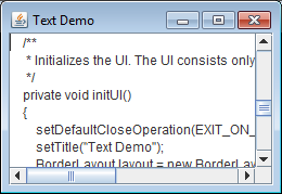
If the canShrink attribute of a percent layout is set to true, the layout manager's behavior when calculating the cell sizes depends on the space currently available. If there is enough space, the calculation is performed as described above. If the space shrinks below this threshold, the layout manager acts as if the cell sizes of all cells had been set to minimum rather than preferred. This means that this time the minimum size of all components involved is queried. For components whose minimum size is equal to their preferred size, or for cells whose size has already been minimum, there is no difference. But other components and cells may be able to shrink. After determining the minimum sizes the layout manager checks whether the layout now fits in the space available or if even more space is available. In this case, the remaining space is again distributed over the cells with a weight factor. This approach allows the layout to shrink in a graceful way. As an example consider the following simple window that only contains a text area. It has a border layout, and the text area is added to the center.
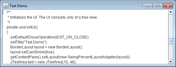
Because the text area has set the number of columns and rows to be displayed it has a preferred size. After opening the window this size is used. The figure shows the window in its preferred size. Now the window's size is reduced. Because the layout can shrink, the text area component becomes smaller, too, which is indicated by the scroll bars.
When working with layouts that can shrink be careful with the components involved: All components with a preferred size larger than the minimum size should be added to cells with a non-null weight factor. Otherwise, the size of these components may suddenly jump from preffered to minimum when the user drags the window to become smaller. This is probably confusing.
After the concepts of the PercentLayout manager have been discussed it is time to have a closer look at the implementation classes. At first there are some helper classes that need to be introduced.
NumberWithUnit
When dealing with GUI programming the default unit for specifying sizes or gaps is typically pixels. This is pretty natural, however, the results of this approach may strongly depend on the users' screen resolution. This means that a layout may look good on one screen, while it is too small or too big on another one. To address this problem the PercentLayout layout manager supports multiple units for sizes or gaps.
All numeric values required for a layout definition are specified as instances of the NumberWithUnit class. As the name implies, this class stores a numeric value (as a floating point number) and an associated unit. It defines methods for converting this value into pixels, which is required for internal layout calculations. The supported units are defined by the Unit enumeration class. These are the following:
To create an instance of NumberWithUnit a double for the actual value and a constant of the Unit enumaration class have to be passed to the constructor. There is also a convenience constructor for pixels, which expects an int. Finally, there is a constructor that takes a string and parses it to a number with a unit. The string must start with a floating point number, followed by optional whitespace and the short name of the unit. Examples for valid strings are 10cm, 10 IN, 10 Dlu, 10px.
CellConstraints
The CellConstraints class is used for defining the properties of a cell (a column or a row) in the layout. An instance stores exactly the properties that have been discused in the last section: the cell size (provided as an instance of the CellSize enumeration class), the minimum size of the cell, the cell alignment (provided as an instance of the CellAlignment enumeration class), and a weight factor.
Instances of CellConstraints are not created directly, but a builder is used for this purpose. This makes the creation of instances pretty convenient as only the properties have to be defined that are needed. The following code fragment shows how the builder is used:
// First create the builder
CellConstraints.Builder builder = new CellConstraints.Builder();

// Now create instances
CellConstraints cc = builder.withCellSize(CellSize.MINIMUM)
                            .withCellAlignment(CellAlignment.CENTER)
                            .withWeight(50)
                            .create();
Basically the several with() methods of the builder are called to define the desired properties. With a call of the create() method the CellConstraints instance is actually created.
Instead of setting the properties of a CellConstraints instance step by step, an instance can also be defined using a specification string. This is a string that defines all possible properties in a compact form. The syntax is as follows:
<cell alignment>/<cell size>(<minimum size>)/<weight>
The alignment, the cell size, and the weight factor can be defined separated by slash ("/") characters. The alignment and the weight factor are optional, only the cell size must be defined. The strings are not case sensitive. The following strings are all valid specification strings:
PercentData
After a layout has been created and configured the components to be managed have to be added. More complex layout managers require constraints objects that exactly specify how a specific component should be handled. For instance, the well-known BorderLayout layout manager from the java.awt package needs a name of a cell, in which the component is to be added (e.g. NORTH or CENTER), as constraints. The java.awt.GridBagLayout layout manager uses the GridBagConstraints class for this purpose. PercentLayout also defines its own class for layout constraints: PercentData.
A PercentData object has the following properties:
To create new PercentData objects an analogous approach is used as for CellConstraints: There is a Builder class which allows setting of properties in a convenient way. A typical sequence for creating PercentData objects using the builder could look as follows:
// First create the builder
PercentData.Builder b = new PercentData.Builder();

// Now create instances
PercentData pd1 = b.xy(1, 2).create();
PercentData pd2 = b.xy(1, 3).spanX(2).withColumnConstraints(columnConstr).create();
The Builder class defines a bunch of methods that correspond to the properties supported by PercentData. The methods withColumnConstraints(), withRowConstraints(), withTargetColumn(), and withTargetRow() should be self-explanatory. With the xy() method the indices of the column and the row the component is to be placed in are specified. The number of columns or rows spanned by the component can be set either separately using the spanX() and spanY() methods or in a single operation using the span() method. Often a PercentData object will only be initialized with the column and row indices - these are the only mandatory properties. For this special use case the Builder class defines the convenience method pos(). pos() sets the indices and creates the new instance immideately. So the create() method need not be called.
CellGroup
The concept of cell groups has already been introduced. Cell groups allow the definition of columns or rows that should always have the same width or height. The corresponding API of PercentLayout makes use of the CellGroup class.
CellGroup is a pretty simple class. It basically manages a number of (0-based) indices for the columns or rows that belong to the group. Typically cell groups do not have too many elements. Therefore there are convenience constructors that accept 2, 3, and 4 indices - this should cover the most frequent use cases. If this is not enough, there is the static fromArray() method, which reads the indices of the group from an arbitrary array.
The static fromString() method allows initializing a CellGroup from a string representation. Valid strings contain the numeric indices separated by various supported separater characters, for instance:
The implementation of the PercentLayout manager is somewhat special because it does not implement a platform-specific layout manager interface. For instance, when working with Swing all layout managers must implement the java.awt.LayoutManager2 interface. The implementation classes of PercentLayout do not do this. Rather, they implement only the layout algorithm in a way that is independent on a concrete GUI library. For accessing platform-specific functionality (e.g. setting or obtaining the size of a component) an adapter is used. The functionality of this adapter is defined by the PercentLayoutPlatformAdapter interface.
The advantage of this approach is that the PercentLayout manager can easily be ported to different UI libraries. The base classes can remain unchanged; only a specialized adapter has to be written. For Swing there is already a fully functional adapter implementation: SwingPercentLayoutAdapter. SwingPercentLayoutAdapter also implements the java.awt.LayoutManager2 interface. When an instance is constructed it is passed the PercentLayout object it is associated with. Then it can be installed as a regular Swing layout manager, for instance:
JPanel panel = new JPanel();
PercentLayoutBase percentLayout = ...
SwingPercentLayoutAdapter adapter = new SwingPercentLayoutAdapter(percentLayout);
panel.setLayout(adapter);
The layout functionality discussed so far is implemented by the PercentLayout class. To install a layout of this type an instance of PercentLayout has to be created and configured. Then a platform-specific adapter has to be associated with it as shown in the code fragment above.
PercentLayout provides three different constructors:
PercentLayout layout = new PercentLayout(
    "3dlu, end/preferred, 3dlu, full/preferred(1in)/50, 7dlu, end/preferred, "
        + "3dlu, full/preferred(1in)/50, 3dlu",
    "3dlu, preferred, 3dlu, preferred, 3dlu, preferred, 7dlu, preferred, "
        + 3dlu, preferred, 3dlu, full/preferred(1in)/100, 3dlu");
After an instance of PercentLayout was created further configuration can be performed:
After the configuration of the PercentLayout object, and with the PercentLayoutPlatformAdapter in place the layout can be used as any regular layout manager instance. This means that components can be added to a container using PercentData objects as layout constraints. We will show this later in the examples section.
PercentLayout is the most generic and powerful layout implementation shipped with the JGUIraffe library. There are a couple of other layout manager implementations on top of PercentLayout for special use cases. One of these is BorderLayout
BorderLayout is very similar to the layout manager with the same name from the standard java.awt package. (More information about java.awt.BorderLayout can be found for instance in the Swing Tutorial.) It provides some additional functionality, e.g. the definition of margins and gaps between the components it manages. And, it is also written in a platform-independent way; so it can easily be ported to other GUI libraries which do not support this type of layout out of the box.
Using BorderLayout is simple. After creating a BorderLayout instance (which does not require any parameters) some configuration properties can be set using the following methods:
BorderLayout also needs a PercentLayoutPlatformAdpater instance. If this adapter has been installed, components can be added to the associated container in the usual way using the CENTER, NORTH, WEST, EAST or SOUTH constants of BorderLayout as constraints. These constraints define, in which of the managed cells the component is to be placed. We will see BorderLayout in action in the examples section.
Dialog boxes often have a bar with buttons at their botton defining the actions the user can invoke, e.g. Save, Cancel, or Help. Given the frequency of this use case, it is surprisingly difficult to create a corresponding layout using Java board means. A bunch of code is required to ensure that the buttons in the button bar are properly aligned and all have the same width. The ButtonLayout class is focused on this use case.
A ButtonLayout object can be instantiated using its default constructor. Then the following properties can be configured:
As for the other layout classes covered so far a PercentLayoutPlatformAdapter is required to embed the layout into a specific GUI platform. Then buttons can be created and added to the container representing the button bar without passing additional constraints objects. They will be automatically added to the layout and placed accordingly. This is shown in detail in the examples section.
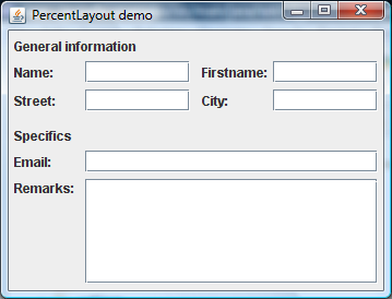
In this section a dialog box using the layout classes discussed in this document is developed. We only focus on the code required to construct the UI; no additional functionality (e.g. for the handling of button clicks) is added. As GUI library we will set on Swing. The following figure shows the final dialog box:
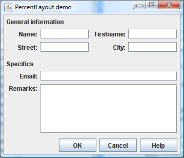
The example layout contains two (logic) columns with labels and input fields in the upper part. All labels have the same length. This is also true for the input fields. In the lower part there are longer input fields. Their labels, however, are aligned with the first labels of the upper part. There are also headings with a larger width.
As a general implementation strategy we will use a BorderLayout that divides the dialog box in a section with the actual input fields (this is a panel which is added to the CENTER) and a section with the buttons (another panel in the SOUTH). All components in the CENTER area can be arranged using a single PercentLayout object. For the buttons of course ButtonLayout is the appropriate choice. The following code shows how the BorderLayout is created and installed at the content pane of the dialog box:
// The layout of the content pane
BorderLayout borderLayout = new BorderLayout();
getContentPane().setLayout(new SwingPercentLayoutAdapter(borderLayout));
As the BorderLayout needs no special configuration, this code is very simple. We could have also set some of the margins, but in this example we use a properly setup PercentLayout to define the margins of the dialog box.
The main area of the dialog box that contains all labels and input elements is realized using PercentLayout. When working with PercentLayout at first the UI has to be devided into columns and rows; then the properties for these columns and rows have to be defined. For our example layout we use 9 columns for the following elements:
The constraints for the layout's rows are less complicated because there are only two types of rows: rows containing components (labels and/or input fields) whose height is derived from their content and rows with a minimum height serving as separators between the other rows. All rows with an even row index (starting at 0) are separator rows. An exception is the row containing the text area. Here also a minimum height is defined so that the text area has a certain initial size. Additionally we specify that additional space in the Y direction should be fully consumed by this row because the text area is the only component in this dialog for which growing in the height makes sense. This is achieved by setting the weight factor of this row to 100. To actually create the layout we use string representations for the constraints we thought about in the last paragraphs. This looks as follows:
// setup the main panel and its layout
JPanel pnlMain = new JPanel();
PercentLayout layout = new PercentLayout(
    "3dlu, end/preferred, 3dlu, full/preferred(1in)/50, 7dlu, end/preferred, "
        + "3dlu, full/preferred(1in)/50, 3dlu",
    "3dlu, preferred, 3dlu, preferred, 3dlu, preferred, 7dlu, preferred, "
        + 3dlu, preferred, 3dlu, full/preferred(1in)/100, 3dlu");
The first string parameter of the constructor defines all columns, the second one defines the rows. As units for margins and spaces we use dialog units. The meaning of the single definition strings should be clear after reading the section about cell constraints. With this constructor all constraints of the layout are specified. What remains is the requirement that some columns should have the same width: the columns with the labels and the columns with the text fields. To achieve this some CellGroup objects are added to the layot.
layout.addColumnGroup(new CellGroup(1, 5));
layout.addColumnGroup(new CellGroup(3, 7));
pnlMain.setLayout(new SwingPercentLayoutAdapter(layout));
These lines add two CellGroup objects for columns. One for the columns with the labels and one for the columns with the text fields. The last line installs the layout in the panel by making use of a Swing-specific layout adapter.
Now it is time for adding components to the layout. First some builder objects for creating helper objects are setup. Then the first header line is defined:
// Builder for creating constraints objects
CellConstraints.Builder cb = layout.getConstraintsBuilder();
PercentData.Builder pcb = new PercentData.Builder();

// Fill a header line
pnlMain.add(
        new JLabel("General information"),
        pcb.xy(1, 1).spanX(7).withColumnConstraints(cb.defaultColumn().create())
           .create());
Each PercentLayout object has its own builder for CellConstraints objects. This builder can also be used by client code. We do this here. The builder for PercentData instances has to be created manually.
The header line consists of a single label. What makes this line special is the fact that the label spans multiple columns - the X span in the PercentData object is set to 7. We also use a specific CellConstraints object. The default constraints for column 1 state that components should be right-aligned. The label acting as header is left-aligned. Now the two rows with labels and text fields are constructed:
// Fill the first data line
pnlMain.add(new JLabel("Name:"), pcb.pos(1, 3));
pnlMain.add(new JTextField(), pcb.pos(3, 3));
pnlMain.add(new JLabel("Firstname:"), pcb.pos(5, 3));
pnlMain.add(new JTextField(), pcb.pos(7, 3));

// Fill the second data line
pnlMain.add(new JLabel("Street:"), pcb.pos(1, 5));
pnlMain.add(new JTextField(), pcb.pos(3, 5));
pnlMain.add(new JLabel("City:"), pcb.pos(5, 5));
pnlMain.add(new JTextField(), pcb.pos(7, 5));
This is pretty straight-forward: The Swing components for the labels and text fields are created and placed into the layout. The PercentData objects used as constraints only define the position in the tabular layout. Because no other properties need to be set the pos() convenience method of the PercentData.Builder class can be used for this purpose.
The lower half of the dialog box is a bit more irregular. There is again a header line which is analogous to the first one. In the following lines the input fields span multiple columns. The line with the text area is heigher than the other rows. Let's have a look at the code:
// Fill another header line
pnlMain.add(
        new JLabel("Specifics"),
        pcb.xy(1, 7).spanX(7).withColumnConstraints(cb.defaultColumn().create())
           .create());

// Fill third data line
pnlMain.add(new JLabel("Email:"), pcb.pos(1, 9));
pnlMain.add(new JTextField(), pcb.xy(3, 9).spanX(5).create());

// Fill fourth data line
pnlMain
        .add(
                new JLabel("Remarks:"),
                pcb.xy(1, 11).withRowConstraints(
                    cb.withCellAlignment(CellAlignment.START)
                      .withCellSize(CellSize.PREFERRED)
                      .create())
                   .create());
pnlMain.add(new JScrollPane(new JTextArea()),
        pcb.xy(3, 11).spanX(5).create());
The header line and the line with the first text field contain nothing new. They define an X span so they cover multiple columns. The row with the text area is a bit more complicated. First, when the layout was constructed a minimum height was defined for this row by specifying the following constraints string: full/preferred(1in)/100. This means that this row has a height of at least 1 inch, which guarantees an appropriate size of the text area. Therefore when adding the text area no special constraints have to be provided except for the column span. For the label however, we have to override the global row constraints. Here the alignment is set to CENTER, which would cause the label to be centered relative to the text area. This would look strange; so we set the alignment in the row constraints to START. This causes the label to be top-aligned. Now the main area of the layout with all input components is complete. What is missing is the button bar:
// The button bar
JPanel pnlButtons = new JPanel();
ButtonLayout buttonLayout = new ButtonLayout();
buttonLayout.setGap(new NumberWithUnit(4, Unit.DLU));
buttonLayout.setLeftMargin(new NumberWithUnit(3, Unit.DLU));
buttonLayout.setRightMargin(new NumberWithUnit(3, Unit.DLU));
pnlButtons.setLayout(new SwingPercentLayoutAdapter(buttonLayout));
pnlButtons.add(new JButton("OK"));
pnlButtons.add(new JButton("Cancel"));
pnlButtons.add(new JButton("Help"));
For the button bar a new panel is created. The layout manager is set to a ButtonLayout instance (using a SwingPercentLayoutAdapter as mediator). Some properties of the ButtonLayout are set, then the buttons are added. That's all. Finally the panels for the main area and the button bar have to be added to the dialog's content pane. It has to be ensured that the appropriate cells of the BorderLyout are used:
getContentPane().add(pnlMain, BorderLayout.CENTER);
getContentPane().add(pnlButtons, BorderLayout.SOUTH);
This was all the code for constructing the UI. For a better overview the whole code of the demo application is presented below. The code lines we just discussed can be found in the init() method.
package net.sf.jguiraffe.examples.gui.layout;

import java.awt.EventQueue;

import javax.swing.JButton;
import javax.swing.JFrame;
import javax.swing.JLabel;
import javax.swing.JPanel;
import javax.swing.JScrollPane;
import javax.swing.JTextArea;
import javax.swing.JTextField;

import net.sf.jguiraffe.gui.layout.BorderLayout;
import net.sf.jguiraffe.gui.layout.ButtonLayout;
import net.sf.jguiraffe.gui.layout.CellAlignment;
import net.sf.jguiraffe.gui.layout.CellConstraints;
import net.sf.jguiraffe.gui.layout.CellGroup;
import net.sf.jguiraffe.gui.layout.CellSize;
import net.sf.jguiraffe.gui.layout.NumberWithUnit;
import net.sf.jguiraffe.gui.layout.PercentData;
import net.sf.jguiraffe.gui.layout.PercentLayout;
import net.sf.jguiraffe.gui.layout.Unit;
import net.sf.jguiraffe.gui.platform.swing.layout.SwingPercentLayoutAdapter;

/**
 * An example of using PercentLayout with Swing.
 */
@SuppressWarnings("serial")
public class SwingPercentLayoutExample extends JFrame
{

    public SwingPercentLayoutExample()
    {
        super();
        init();
        pack();
    }

    /**
     * Constructs the GUI of this frame.
     */
    protected void init()
    {
        // init frame
        setDefaultCloseOperation(JFrame.EXIT_ON_CLOSE);
        setTitle("PercentLayout demo");

        // The layout of the content pane
        BorderLayout borderLayout = new BorderLayout();
        getContentPane().setLayout(new SwingPercentLayoutAdapter(borderLayout));

        // setup the main panel and its layout
        JPanel pnlMain = new JPanel();
        PercentLayout layout = new PercentLayout(
                "3dlu, end/preferred, 3dlu, full/preferred(1in)/50, 7dlu, "
                + "end/preferred, 3dlu, full/preferred(1in)/50, 3dlu",
                "3dlu, preferred, 3dlu, preferred, 3dlu, preferred, 7dlu, "
                + "preferred, 3dlu, preferred, 3dlu, full/preferred(1in)/100, 3dlu");
        layout.addColumnGroup(new CellGroup(1, 5));
        layout.addColumnGroup(new CellGroup(3, 7));
        pnlMain.setLayout(new SwingPercentLayoutAdapter(layout));

        // Builder for creating constraints objects
        CellConstraints.Builder cb = layout.getConstraintsBuilder();
        PercentData.Builder pcb = new PercentData.Builder();

        // Fill a header line
        pnlMain.add(new JLabel("General information"), pcb.xy(1, 1).spanX(7)
                .withColumnConstraints(cb.defaultColumn().create()).create());

        // Fill the first data line
        pnlMain.add(new JLabel("Name:"), pcb.pos(1, 3));
        pnlMain.add(new JTextField(), pcb.pos(3, 3));
        pnlMain.add(new JLabel("Firstname:"), pcb.pos(5, 3));
        pnlMain.add(new JTextField(), pcb.pos(7, 3));

        // Fill the second data line
        pnlMain.add(new JLabel("Street:"), pcb.pos(1, 5));
        pnlMain.add(new JTextField(), pcb.pos(3, 5));
        pnlMain.add(new JLabel("City:"), pcb.pos(5, 5));
        pnlMain.add(new JTextField(), pcb.pos(7, 5));

        // Fill another header line
        pnlMain.add(new JLabel("Specifics"), pcb.xy(1, 7).spanX(7)
                .withColumnConstraints(cb.defaultColumn().create()).create());

        // Fill third data line
        pnlMain.add(new JLabel("Email:"), pcb.pos(1, 9));
        pnlMain.add(new JTextField(), pcb.xy(3, 9).spanX(5).create());

        // Fill fourth data line
        pnlMain.add(new JLabel("Remarks:"), pcb.xy(1, 11).withRowConstraints(
                cb.withCellAlignment(CellAlignment.START).withCellSize(
                        CellSize.PREFERRED).create()).create());
        pnlMain.add(new JScrollPane(new JTextArea()), pcb.xy(3, 11).spanX(5)
                .create());

        // The button bar
        JPanel pnlButtons = new JPanel();
        ButtonLayout buttonLayout = new ButtonLayout();
        buttonLayout.setGap(new NumberWithUnit(4, Unit.DLU));
        buttonLayout.setLeftMargin(new NumberWithUnit(3, Unit.DLU));
        buttonLayout.setRightMargin(new NumberWithUnit(3, Unit.DLU));
        pnlButtons.setLayout(new SwingPercentLayoutAdapter(buttonLayout));
        pnlButtons.add(new JButton("OK"));
        pnlButtons.add(new JButton("Cancel"));
        pnlButtons.add(new JButton("Help"));

        getContentPane().add(pnlMain, BorderLayout.CENTER);
        getContentPane().add(pnlButtons, BorderLayout.SOUTH);
    }

    public static void main(String[] args)
    {
        final SwingPercentLayoutExample exFrame = new SwingPercentLayoutExample();
        EventQueue.invokeLater(new Runnable()
        {
            public void run()
            {
                exFrame.setVisible(true);
            }
        });
    }
}
